What Is Typography? | Design Glossary
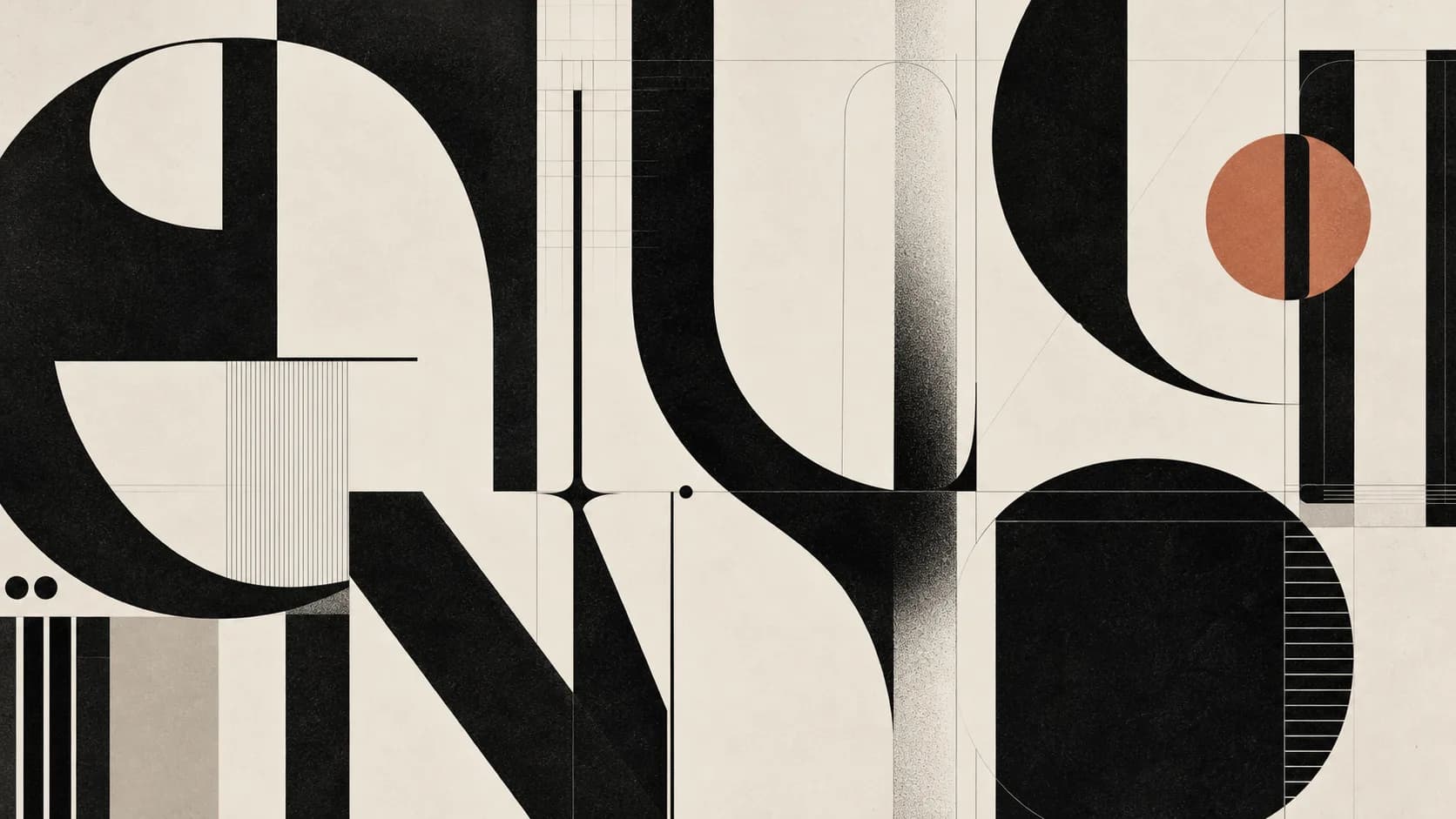
Look at a design and sometimes the first thing you notice is not an image.
It is how a word looks.
The distance between the letters, the weight of the type, the order of the lines, the character of the typeface.
All of it changes how the design is read.
This is where typography comes in.
Typography is far more than choosing a beautiful typeface.
What is typography?
At its simplest:
Typography is the art of arranging type and letters visually.
From which typeface is used to the space between the letters, from the line spacing to where the text sits on the page — many decisions are part of typography.
In a design, type is not used only to give information.
It carries a feeling and a character as well.
Serious.
Playful.
Modern.
Classical.
Technological.
Luxurious.
Minimal.
Sometimes we can say all of it through the look of a single word.
Are a font and typography the same thing?
Not exactly.
The two are often used in place of one another.
A font is a particular form of a particular typeface.
Typography is the wider field covering how that type is used inside a design.
So:
Choosing a font is a decision.
Typography is how you use that font.
Two different designs using the same font can look completely different because of their typographic arrangement.
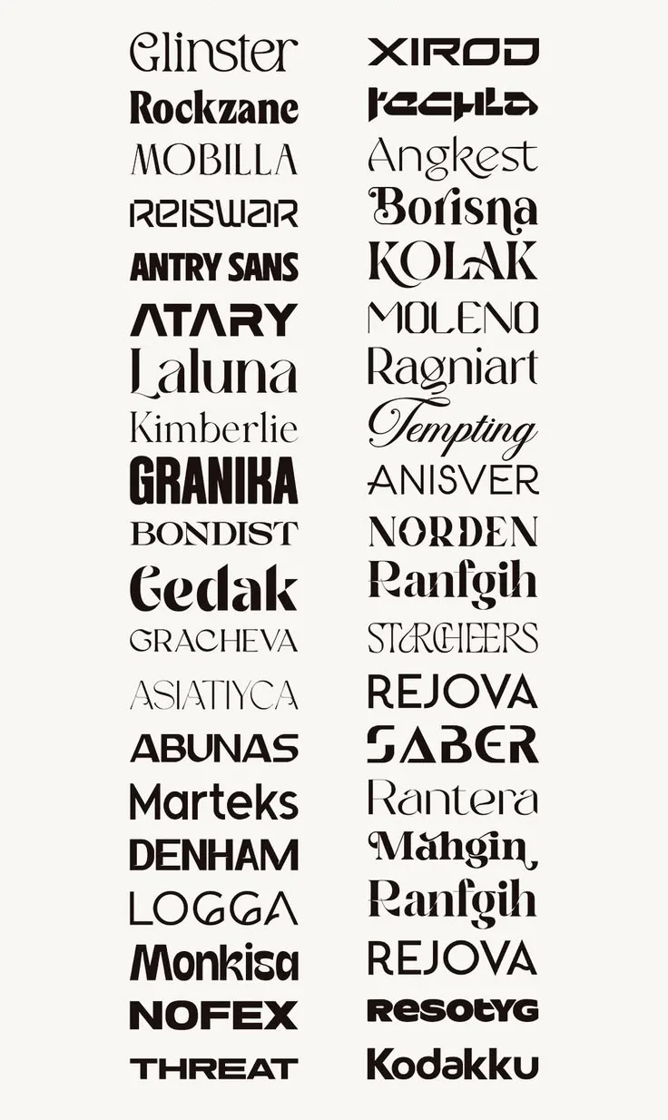
Can a typeface change a brand's character?
Absolutely.
Think of a brand name:
KREARTİF
Set it in a fine, elegant serif and it gives one feeling.
Set it in a bold, geometric sans serif and it looks entirely different.
Set it in a script and it can turn into another identity altogether.
The word is the same.
The letters are the same.
But the character changes.
That is the power of typography.
What are serif and sans serif?
One of the most basic distinctions in typography is between serif and sans serif typefaces.
Serif
There are small strokes at the ends of the letters.
They can create a more classical, traditional or editorial feeling.
They turn up often in books, in magazines and in some corporate identities.
Sans serif
The letters do not have those strokes at their ends.
They can offer a plainer, more modern and cleaner look.
They are very common in digital interfaces, in advertising work and in contemporary brand identities.
But there is an important point here:
There is no firm rule that "serif is classical and sans serif is modern".
The character of the typeface, the way it is used and the other design elements can change the result.
What is kerning?
One of the terms we meet often in typography is kerning.
Kerning is adjusting the space between two letters specifically.
Some pairs of letters, set side by side, can leave more space between them than they should.
The designer can adjust that space so it looks optically more balanced.
It seems like a small detail.
But in logos, headlines and large type in particular it can seriously affect the quality of a design.
What are tracking and leading?
In typography it is not only the space between two letters that matters.
Tracking
The general distance between the letters in a word or a text.
Leading
The vertical space between the lines.
If the lines of a paragraph are too close together, the text can look cramped.
Opened too far, the text loses its unity.
Good typography makes those spaces build a rhythm the eye can read comfortably.
Why does typography matter?
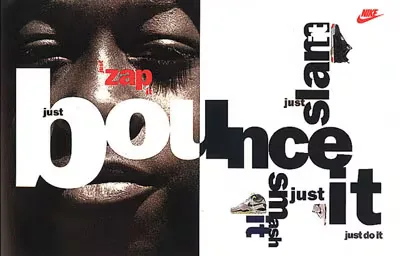
Because type is an image too.
A billboard might carry only a few words.
A website might carry hundreds.
A package might carry the name of the product.
An Instagram post might carry a single sentence.
In all of them, typography affects how the message is read.
The wrong typeface or a poor typographic arrangement can reduce the effect of a good idea.
The right typography can sometimes carry a design almost on its own.
What should good typography be like?
Good typography does not have to look merely "beautiful".
First of all it should be legible.
Then it should suit the purpose of the design.
The typography of a children's brand is not expected to be the typography of a law firm.
The communication of a technology brand and that of a luxury fashion brand may not need the same typographic character either.
So, rather than asking:
"Is this font beautiful?"
it may be better to ask:
"What is this font saying?"
Using many fonts does not mean better design
One of the common mistakes in design is using too many fonts.
One for the headline.
Another for the subhead.
Another for the text.
Another for the button.
And a decorative one on top.
The result is usually a confused picture.
In most designs, a strong hierarchy built with a few typefaces is enough.
What matters here is less the number of fonts than the relationship between them.
Typography and the brand
A brand's typography is one of the important parts of its visual identity.
When the typefaces it uses beyond the logo, its headlines, its website, its social media posts, its presentations and its advertising all carry the same typographic language, the brand looks more coherent.
So typography is not merely a font a graphic designer picked.
It is the visual answer to how the brand speaks.
Just as a brand's voice reflects its character, its typography can do the same thing visually.
Typography, briefly
To put typography in one sentence:
It is taking type out of being information to be read and turning it into a part of the design.
The choice of typeface.
The spaces between letters.
The spaces between lines.
The size.
The hierarchy.
The alignment.
When all of it comes together, typography appears.
And good typography usually does not show itself by shouting.
It simply stands in the right place, in the right way.
Perhaps that is the finest thing about good typography:
It makes reading easier while making the design more beautiful.
TRIUS CREATIVE | Design Glossary
We explain the terms used in the design and advertising world in language anyone can follow.
Design Glossary #03 — Typography
See you at the next term.
Read next
What Is a Moodboard? | Design Glossary
What is a moodboard and what is it for? How moodboards are used in design and creative processes, what goes into them, and how a good one is put together.
What Is a Key Visual? | Design Glossary
What is a key visual and what is it for? The importance of the main visual idea in an advertising campaign, where it is used, and how it differs from a logo.

Is Artificial Intelligence Stopping Us From Having Ideas?
How is artificial intelligence changing the way designers arrive at ideas? A look at the relationship between AI and creativity, at the designer's role, and at the future of creative thinking.