What Is a Key Visual? | Design Glossary
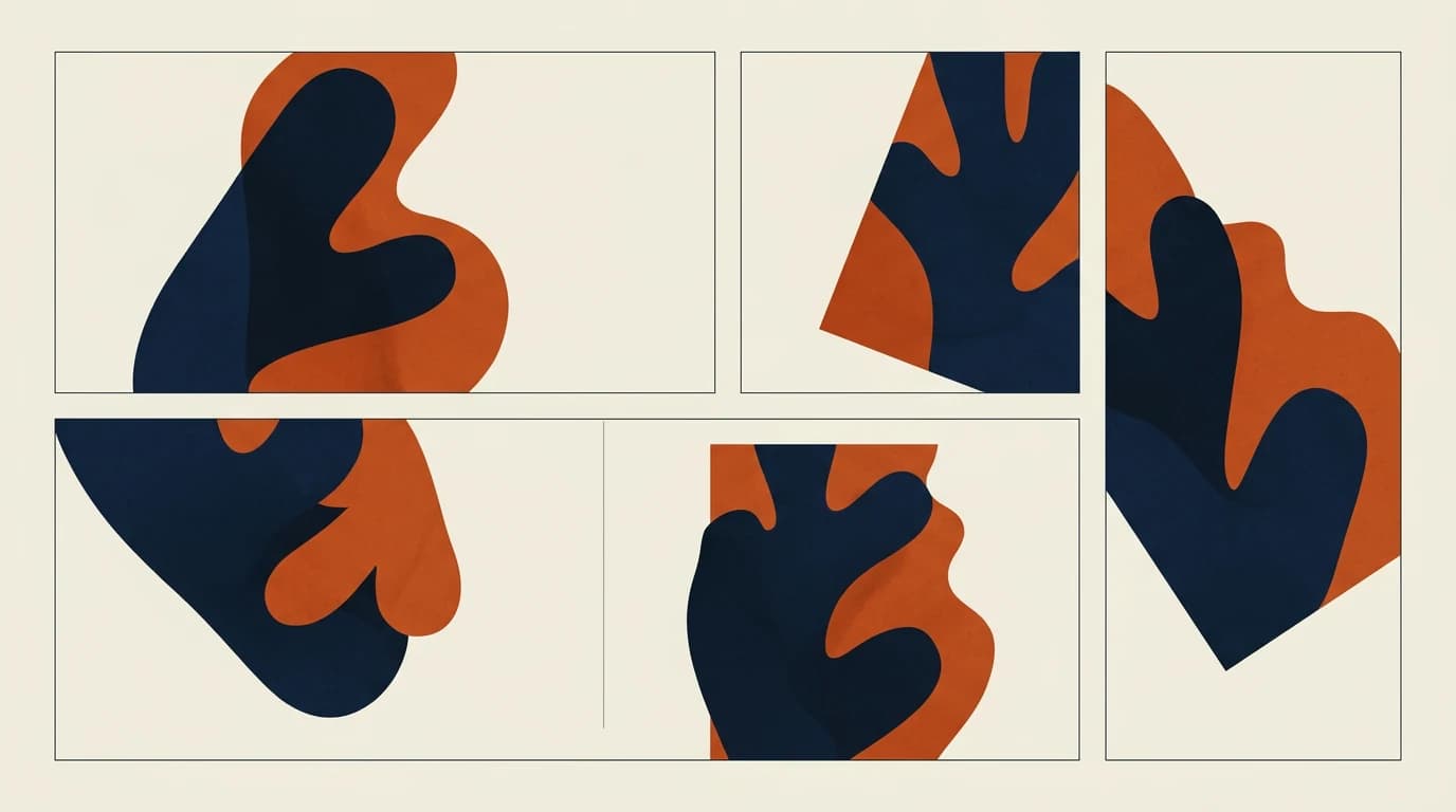
Look at an advertising campaign and sometimes a single image tells the whole of it.
The same colours, a similar composition, the same character, the same photographic language, or one strong visual idea repeating.
You meet it at one size in an Instagram post, another on a billboard, another on a website — and you understand that all of them belong to the same campaign.
This is where the key visual comes in.
What is a key visual?
At its simplest:
A key visual is the main visual idea of an advertising campaign.
It represents the campaign's message visually and forms a visual spine that can be used across different channels.
It can be a photograph.
It can be an illustration.
It can be a graphic idea.
It can be a character.
A particular composition, a use of colour or an entire visual metaphor can be part of the key visual too.
What matters is not producing a single "beautiful image" but arriving at a recognisable visual idea that can live across the campaign's different applications.
Why is a key visual used?
Think of a campaign running across different media.
For the same campaign there might be:
A billboard
An Instagram post
An Instagram story
A web banner
A newspaper advertisement
A brochure
Digital advertising
Outdoor advertising
Every medium has its own size and its own way of being used.
But all of this work has to be understood as belonging to one campaign.
The key visual works here as a visual binding.
The main idea is kept; the design is adapted to the different formats.
Which stops the campaign from looking disconnected from itself across its channels.
Is a key visual only an image?
There is an important distinction here.
Thinking of the key visual as merely "the photograph the campaign uses" is not right.
A good key visual builds a visual system with it.
For example:
Photograph + colour palette + typography + composition + graphic elements + visual metaphor
can together form the visual world of the campaign.
So rather than:
"The campaign's single image"
it is more accurate to think of the key visual as:
"The campaign's main visual idea, reproducible across different media."
A logo and a key visual are not the same thing
These two are often confused.
A logo is the basic mark representing the identity of a brand.
A key visual is the visual expression of a particular campaign or communication idea.
A brand's logo can stay the same for years.
But the key visual of its summer campaign can be one thing and the key visual of its new year campaign another.
In short:
Logo: "Who is this brand?"
Key visual: "What is this campaign saying, and how is it showing it?"
The difference between a key visual and a slogan
A slogan is not a key visual either.
The slogan carries the verbal idea of the campaign.
The key visual builds the visual answer to that idea.
Say a campaign's message is:
"Discover the energy of summer."
The sun, the movement, the colours, the positioning of the product and a particular visual metaphor supporting that message can form the campaign's key visual.
So: whatever the slogan says, the key visual helps to show it.
What should a good key visual be like?
Not every beautiful image is a good key visual.
1. It should carry a strong idea
What it wants to say should be readable at first glance.
Loading too many ideas into the same image can lose the main message.
2. It should be memorable
It matters that people can remember the campaign not only by its logo but by its visual world.
3. It should adapt to different media
An Instagram post can be square.
A story can be vertical.
A billboard can be horizontal.
A web banner can be a very different size again.
A good key visual has the flexibility to be adapted to all of these formats.
4. It should relate to the brand
However creative a key visual is, if no connection to the brand can be made it drifts from its purpose.
The visual idea should support the campaign's message and form a meaningful relationship with the brand.
Where is a key visual used?
The field of use is broad.
Digital:
Social media
Websites
Digital advertising
Banners
Email campaigns
Traditional media:
Billboards
Magazines
Newspapers
Brochures
Posters
Physical spaces:
In-store applications
Windows
Stands
Event spaces
Video:
Advertising films
Video openings
Social media videos
YouTube advertising
Different applications are made for different media, but the visual idea stays part of the same campaign.
Why does a key visual matter?
A good key visual does not only make a campaign look good.
It gives the campaign an identity.
When you see a billboard, and a few days later see the same colours and the same visual language on Instagram, it lets you say:
"This is the same campaign."
Which helps the campaign stay in the mind and be read as a whole across its different touchpoints.
The key visual, briefly
Think of a campaign.
It has a slogan.
It has a message.
It has an audience.
And it has a visual idea that makes all of that felt at a glance.
That visual idea is usually the key visual.
Put another way:
Strategy decides what we are going to say.
The slogan turns it into words.
The key visual makes it visible.
And a good key visual keeps the campaign's visual whole intact by stopping it from looking disconnected across its media.
TRIUS CREATIVE | Design Glossary
We explain the terms used in the design world in language anyone can follow.
Design Glossary #01 — Key Visual
See you at the next term.
Read next

What Is a Moodboard? | Design Glossary
What is a moodboard and what is it for? How moodboards are used in design and creative processes, what goes into them, and how a good one is put together.
What Is Typography? | Design Glossary
What is typography? Type, font, kerning, tracking and leading explained, and the part writing plays in design and in a brand's communication.

Is Artificial Intelligence Stopping Us From Having Ideas?
How is artificial intelligence changing the way designers arrive at ideas? A look at the relationship between AI and creativity, at the designer's role, and at the future of creative thinking.