Seljuk Kufic: From Writing to Geometry
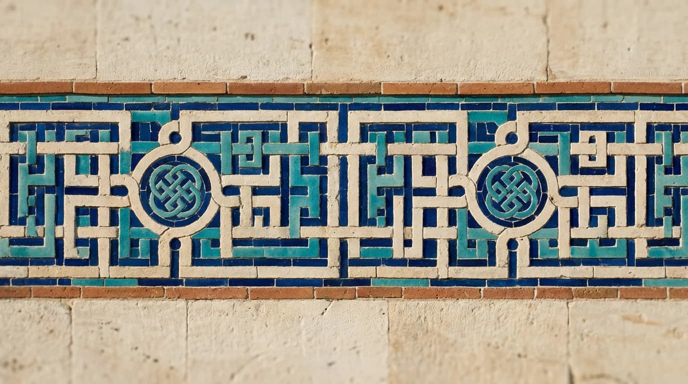
When we look at writing, we usually try to work out what it says first.
And yet there is writing that is seen before it is read.
The vertical and horizontal movements of the letters, their repetitions, the way they tie into one another and the geometric order they build take writing out of being merely a means of communication and turn it into a design element in its own right.
The Kufic inscriptions found in Seljuk architecture are among the most striking examples of this.
Looked at today, from the point of view of graphic design, typography and lettering, there is a very familiar world here: grid, rhythm, repetition, proportion, space and form.
What is Kufic?
Kufic is regarded as one of the oldest scripts of Islamic calligraphy, and it stands out for its angular, geometric character in particular.
Taking its name from the city of Kufa in Iraq, the script took on different forms over time; in architectural ornament especially it stopped being writing that merely carried a text and became a decorative and geometric element.
In the Great Seljuk and Anatolian Seljuk periods, geometric scripts such as Kufic and Ma'qili were used widely in architecture. Research shows that from the eleventh century onwards such scripts held an important place in architectural structures. (DergiPark)
The important point here is this:
A letter is no longer only a letter.
It is also a shape.
Why is writing so geometric in Seljuk art?
Look at Anatolian Seljuk art and you see geometry almost everywhere.
On tiled surfaces, in stonework, in stars, in interlaces, in muqarnas and in ornamental compositions.
Kufic settles into that geometric world entirely naturally.
Thanks to their angular, upright character, the letters can form a composition out of horizontal, vertical and diagonal lines.
Which is why Kufic forms such a strong relationship with architectural surfaces.
Research also draws attention to how the geometric structure of Kufic can be adapted to different surfaces and scales. The script can build new compositions together with geometric and vegetal ornament. (DOAJ)
In other words:
Rather than changing the writing to suit the building, turning the writing into a part of the architecture.
Knotted Kufic: where the letters tie together
Different decorative interpretations of Kufic can be seen in the Seljuk period.
One of them is knotted Kufic.
The Karatay Madrasa in Konya is one of its remarkable examples.
In the Kufic band on the drum of the dome, made with the mosaic tile technique, the vertical extensions of the letters curl into circular or angular knots. From a distance the writing can almost be read as a weave or a geometric net. (DergiPark)
There is a very interesting design problem here:
Building writing that can be read, and holding the visual whole together at the same time.
It is remarkably close to the problem we meet today when designing a logotype or a bespoke typeface.
Writing, or pattern?
This is one of the most interesting questions to ask of Seljuk Kufic.
Past a certain point we begin to see the shape it makes rather than read the meaning it carries.
The repetition of the letters builds a rhythm.
The empty spaces balance the composition.
The vertical lines create movement.
The horizontal lines tie the structure together.
The knots and interlaces carry the visual continuity.
Research notes that in some examples in Anatolian Seljuk architecture, Kufic letters are used not inside a band of writing at all but as a motif of the architectural ornament itself. (DergiPark)
And at that point Kufic becomes a fascinating example standing on the border between typography and graphic design.
There is a grid here
For today's designer this is perhaps the most familiar part.
Think about the geometric character of Kufic and the grid system comes to mind whether you invite it or not.
Where a letter will begin.
How far it will rise.
Where it will turn.
Where it will meet another letter.
How much space will be left.
None of it happens at random.
Studies show that geometric Kufic compositions use horizontal, vertical, diagonal and circular movements together, and that the letters are arranged within particular proportions and geometric rules. (DOAJ)
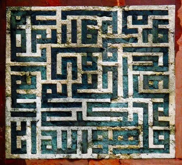
We are not, of course, talking about exactly the same thing as the grid in a design application today.
But as a way of thinking there is a strong resemblance:
System first. Creativity after.
Why should today's designer look at this?
Because Kufic reminds us of something important:
Geometry is not the opposite of creativity.
On the contrary: sometimes the system that sets the limits of creativity is what makes the design stronger.
We meet similar questions when designing a logo today.
How is a letter simplified?
In how few lines can a form be expressed?
How far can a letter be changed without breaking its character?
How do repeating forms make a whole?
How much space can a composition lose?
All of them turn out to be today's versions of questions asked hundreds of years ago, with a different technique and in a different cultural context.
From Kufic to typography
Looking at Kufic from the point of view of modern graphic design does not mean studying an art form left behind in the past.
It also means seeing how a letter turns into a visual form.
In lettering, in logotype design and in experimental typography, how letters are positioned between legibility and visual character is an important question today.
The Kufic examples show that this question has a very old and very strong visual inheritance behind it.
Geometric, woven and knotted Kufic in particular show how letter, space, repetition and rhythm can come together to build a new visual system. (DergiPark)
What has not changed
Technology changed.
The tools changed.
The design applications changed.
But some fundamentals did not.
Proportion.
Rhythm.
Balance.
Space.
Repetition.
Contrast.
And, of course, a good idea.
Centuries lie between the tools in the hands of a Seljuk stonemason or tile maker and the tools today's designer uses.
But a similar question stands in front of both:
How do we turn the forms in our hands into a meaningful, balanced whole?
Perhaps that is exactly why we are looking at Seljuk Kufic again today.
Because Kufic is not only a script left over from the past.
It is a powerful visual inheritance, showing that letters can be design elements as well.
And sometimes, to design something new, you do not really need to find something new.
Looking a little more carefully at how it was designed in the past is enough.
From TRIUS CREATIVE
We believe design is not made of today's trends alone.
Typography, architecture, art, history and culture are a great visual archive feeding design thinking.
Seljuk Kufic is one of the parts of that archive still able to inspire.
Looking at the letters of the past and thinking about the design of today.
A fine place to start, we think.
Read next
Is Artificial Intelligence Stopping Us From Having Ideas?
How is artificial intelligence changing the way designers arrive at ideas? A look at the relationship between AI and creativity, at the designer's role, and at the future of creative thinking.

The Story of a Colour: Watching Exceptional Colours
A personal look at the history of colour, its role in design and its relationship with creative thinking, starting from TRT 2's documentary series Exceptional Colours.
Magnum Photos and Ara Güler: Seeing a City
A short look at storytelling in photography, at composition, and at the visual memory of Istanbul, by way of Magnum Photos and Ara Güler.