The Story of a Colour: Watching Exceptional Colours
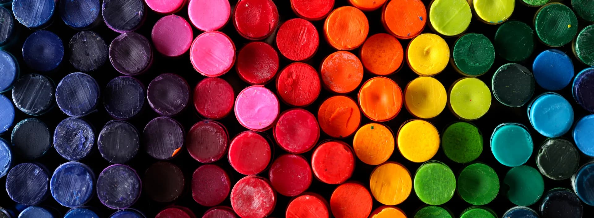
When we choose a colour, what are we actually choosing? Is a colour only a colour, or does it carry a story thousands of years old behind it?
Some documentaries are watched and then they are over.
Others stay in your mind afterwards. They make you look a little more carefully at things you never noticed in daily life.
TRT 2's series İstisnai Renkler — Exceptional Colours — was exactly that kind of documentary for me.
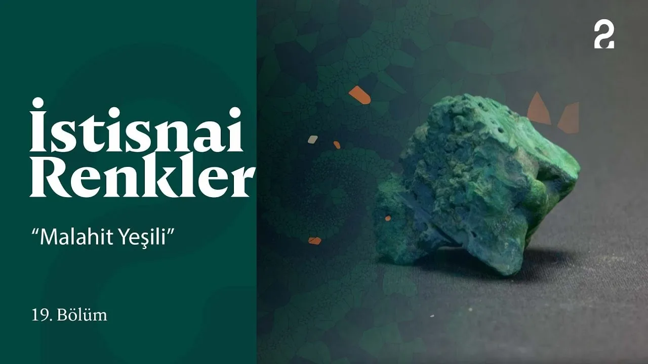
As someone who has worked in design and communication for years, colour is already one of the important parts of the job. Working on a brand, preparing a film, designing a poster, thinking about a corporate identity — we are constantly making decisions about colour.
But watching this documentary I thought about it again:
Most of the time we look at how a colour appears inside a design, not at its story.
And yet the story of colour is far older than our design files.
How does a colour become a story?
Watching the story of Egyptian Blue, in one of the early episodes, made this clearer.
Today it is a blue we can pick with a couple of clicks on a screen.
But thousands of years ago, obtaining it meant bringing different materials together, finding the right production method and running a very particular process.
Made with components such as copper, sand, soda and calcium, Egyptian Blue has a past reaching from Ancient Egypt to the Roman period, from the frescoes of Pompeii to all sorts of works of art.
More interesting still, the story does not end there.
Because of its physical properties, a pigment used for art thousands of years ago is the subject of technological and biomedical research today.
Watching it, this went through my mind:
A colour we pick from a palette in a design application can have a story thousands of years old behind it.
For a designer, it is hard to think of a finer reminder.
A colour is not only a colour
Choosing a colour is easy today.
Red.
Blue.
Green.
Black.
White.
We even define colours by their codes most of the time:
#FF0000
#000000
#FFFFFF
But look a little more closely at the history of a colour and you notice how superficial those codes are.
You start to wonder where a colour came from.
What was it made of?
How hard was it to obtain?
Who was able to use it?
Was it expensive?
In which period was it valuable?
In whose works does it appear?
Which geography did it become identified with?
That the materials used to make some pigments were poisonous, that some were extremely hard to obtain or tied to particular geographies, tells us something else as well:
Throughout history, colour has never been only an aesthetic matter.
It has an economy.
It has a trade.
It has a technology.
It has a culture.
It has an art history.
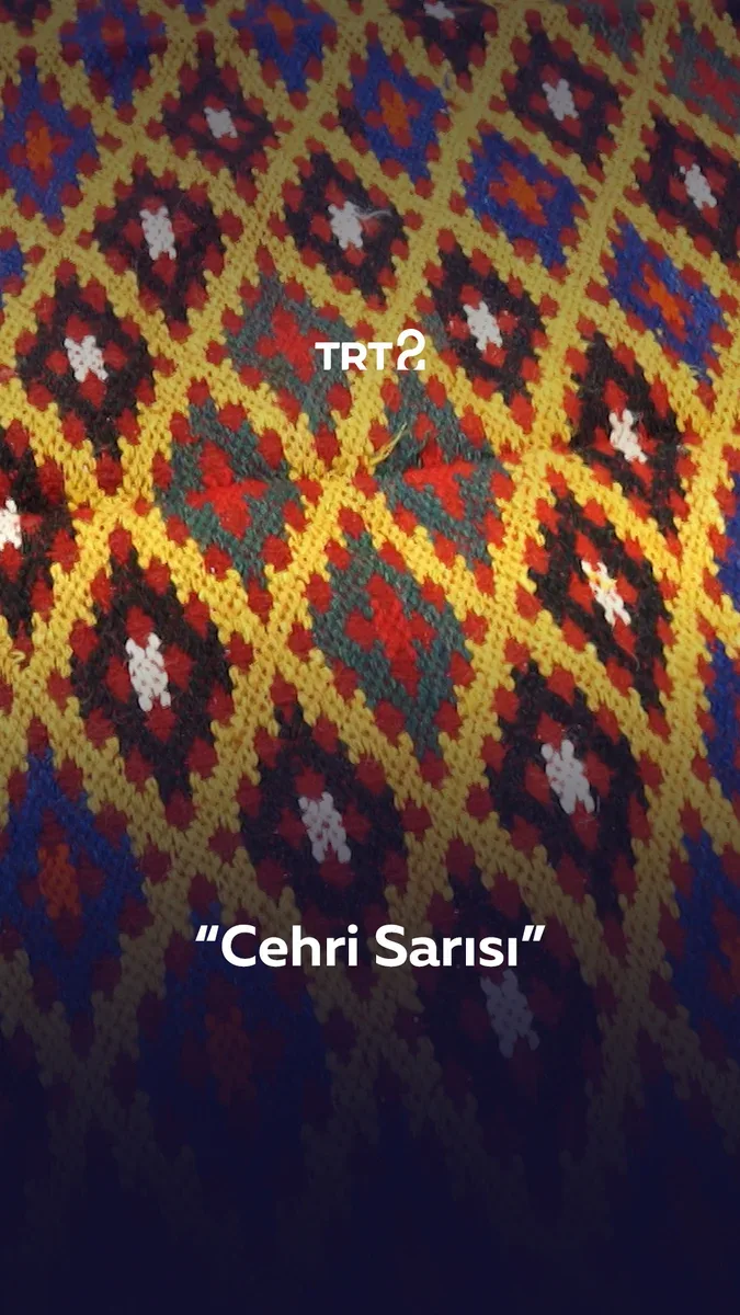
And at the end of all of it comes the thing we call "colour" today.
The relationship between design and colour
So what does any of this have to do with advertising and design?
A great deal, in fact.
Because in design, colour is not only an aesthetic decision.
It affects how a brand is read.
It changes the atmosphere of a film.
It decides how visible a package is on the shelf.
It changes the feeling of a space.
But one of the things I have learned over the years working on brands and communication is this:
The meaning of a colour is not in the colour alone.
"Blue gives confidence."
"Red is energetic."
"Black stands for luxury."
These sentences may sound right. In fact they are incomplete.
Because colour is not the only thing deciding what a colour means.
Culture.
Sector.
Audience.
Typography.
Photography.
Composition.
The brand's past.
The story the brand wants to tell.
When all of it comes together, colour really does become an instrument of communication.
Which is why, for me, the right question is no longer only:
"Is this colour beautiful?"
The real question is:
"Why is this colour here?"
Design is partly learning how to look
Over the years, design has stopped meaning simply being able to use design applications.
Past a certain point you start to think that other things matter far more than knowing the software.
Looking.
Being curious.
Researching.
Questioning.
Looking at a shop sign and wondering about the typeface.
Seeing an old package and thinking about why those colours were chosen.
Researching why a brand's logo has been simplified over the years.
Noticing why a particular light or palette was used in a film.
Trying to understand why a painting in a museum is still striking hundreds of years later.
I think creativity begins partly here.
Because a new idea does not always appear in front of a blank page.
Sometimes it is in an old sign you see in the street.
Sometimes in a book.
Sometimes in a frame of a film.
Sometimes in a museum.
And sometimes in the story of a pigment thousands of years old.
What Exceptional Colours made me think
Watching the stories of colours like Cochineal Red, Turkey Red, Tyrian Purple, Paris Green, Lapis Lazuli and Cobalt Blue across the episodes, you are really following one thing:
The relationship people have built with colour.
And that relationship is much older than we assume.

The colour we use in a brand's identity today is a very small part of a search for colour that humanity has been conducting for thousands of years.
Think about that and design begins to look a little different, too.
Because we are not always inventing something entirely new.
We are adding new things on top of a visual language that has been going on for thousands of years.
Choosing a colour for the next design
Perhaps, the next time we open the palette, we can ask ourselves a few more questions:
Why this colour?
Why for this brand?
What does it mean in this culture?
What relationship does it form with the colours beside it?
What do we want someone to feel when they see it?
And perhaps most important of all:
Does this colour have a story to tell?
That is exactly what stayed with me after watching Exceptional Colours.
It is a little harder now to see colours as merely one of the tools we use in design.
Because some colours are a story in themselves.
And perhaps one of the starting points of good design is being curious about that story.
A note from TRIUS CREATIVE
I believe good ideas do not always appear around a meeting table.
Sometimes it happens while watching a documentary.
Sometimes at an old sign you pass on a walk.
Sometimes in a book.
And sometimes in the story of a colour thousands of years old.
This piece came about a little like that.
I watched a documentary.
I thought about colours.
Then I looked at design again.
Perhaps creativity is partly that:
To keep looking.
To watch: TRT 2 — the İstisnai Renkler playlist
Read next
Is Artificial Intelligence Stopping Us From Having Ideas?
How is artificial intelligence changing the way designers arrive at ideas? A look at the relationship between AI and creativity, at the designer's role, and at the future of creative thinking.
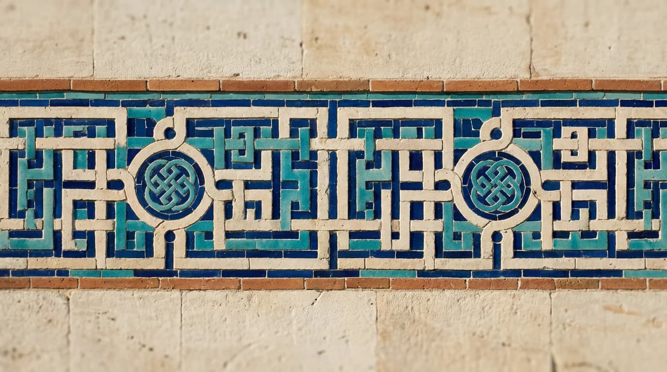
Seljuk Kufic: From Writing to Geometry
The geometric structure of Seljuk Kufic, the knotted Kufic examples, and what the script has to do with typography, the grid, rhythm and design.
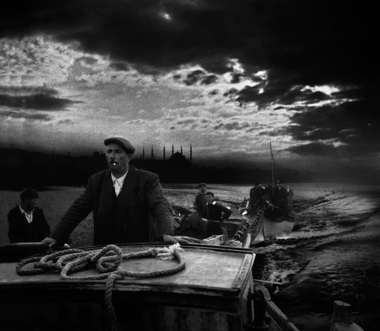
Magnum Photos and Ara Güler: Seeing a City
A short look at storytelling in photography, at composition, and at the visual memory of Istanbul, by way of Magnum Photos and Ara Güler.